I like the tonality. It looks like a toned black and white print. It’s appropriate to the subject, I think (just as the straight color/b+w style is appropriate to the images you make of landscape and architectural details).
The picture have held many noisy or unnecessary objects in the frame.
I try to cut off it by coloring tone down process.
Interesting. I like the softer quality of this image and the one before it.
nice!
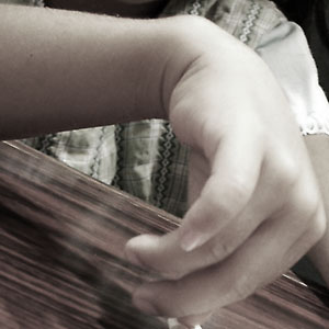
I like the tonality. It looks like a toned black and white print. It’s appropriate to the subject, I think (just as the straight color/b+w style is appropriate to the images you make of landscape and architectural details).
The picture have held many noisy or unnecessary objects in the frame.
I try to cut off it by coloring tone down process.
Interesting. I like the softer quality of this image and the one before it.